Developing a landscape photo
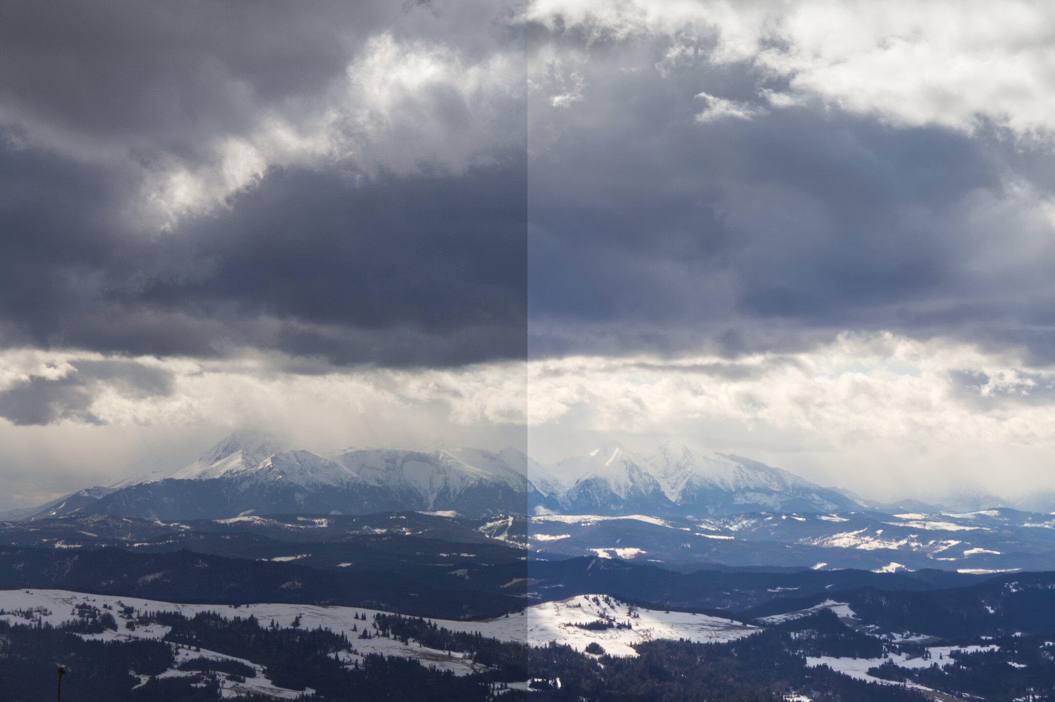
My development process for well-exposed and well-composed RAW landscape photos.
Original photo #
Let’s have a look at the original photo. It’s fairly well-exposed and composed. There are no completely black or overexposed areas. However, because of the heavy clouds, it looks a little bit dark and dull.
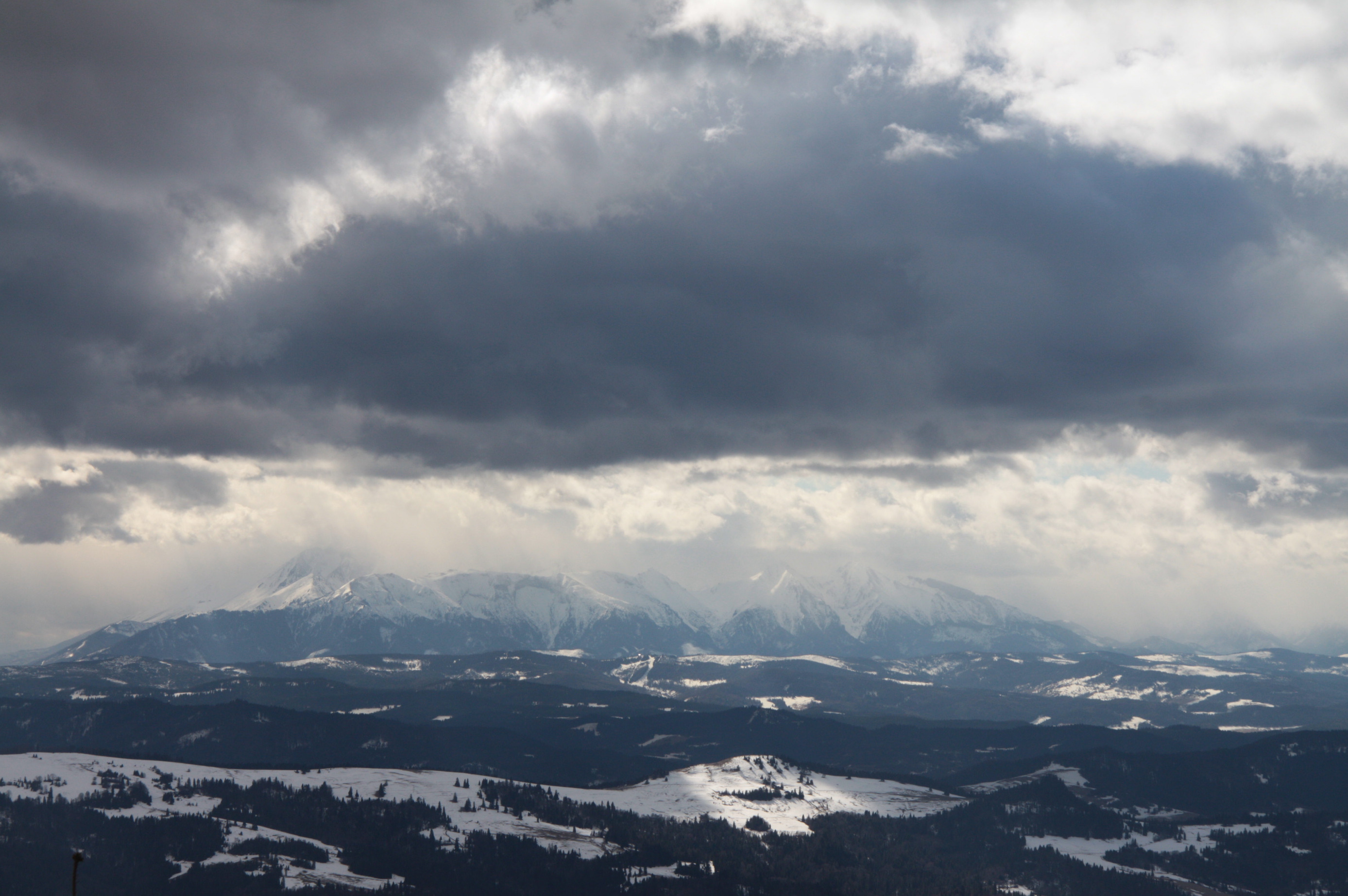
My goal for this edit was to make the photo more lively, vibrant, and punchy. I also wanted to retain the heavy sky element. I think it compliments the mountaintops nicely and makes the composition more interesting. On top of that, I wanted to make the mountains more prominent.
I sometimes don’t know how I want to develop my photos. In such cases, I often just go with the flow. I can always roll back my changes if needed!
Technicalities #
I captured this photo with a Canon EOS 50D body and Canon EF-S 17-85 mm f/4-5.6 IS USM lens. There was plenty of light, so I could use low ISO (200) and fairly high aperture (f/16) to get the most from the scene. With 1/250 exposure time, 61mm focal length, and optical stabilization, I could comfortably take this photo without a tripod.
When it’s cold, camera sensors tend to generate less noise. Experiment with higher-than-usual ISO values in winter!
I saved the image in Canon’s RAW format (CR2). By using RAW instead of preprocessed and compressed JPEG, I was able to capture the most information in the file. This came in handy later on.
I used to use a desktop version of Lightroom®. Recently, I switched to Affinity® Photo 2 for iPad® and I love this app! I wish Serif® could add a way to copy-paste edits from one photo to another, but hey! You cannot have everything.
Development #
I opened the CR2 file in a dedicated RAW editor built into Affinity Photo. This way, I was able to make adjustments without sacrificing the image quality and creating artifacts.
Exposure #
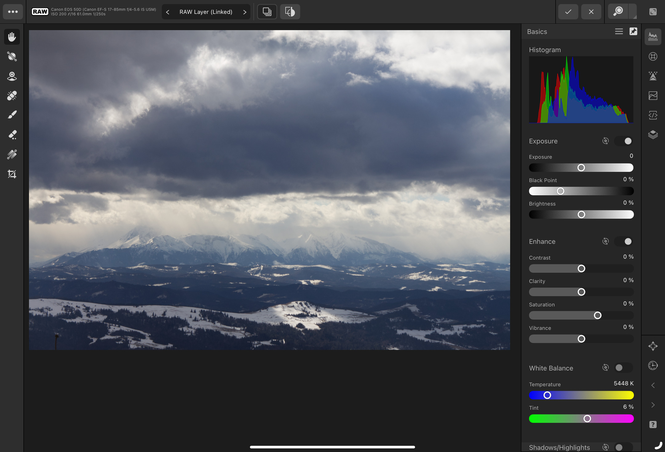
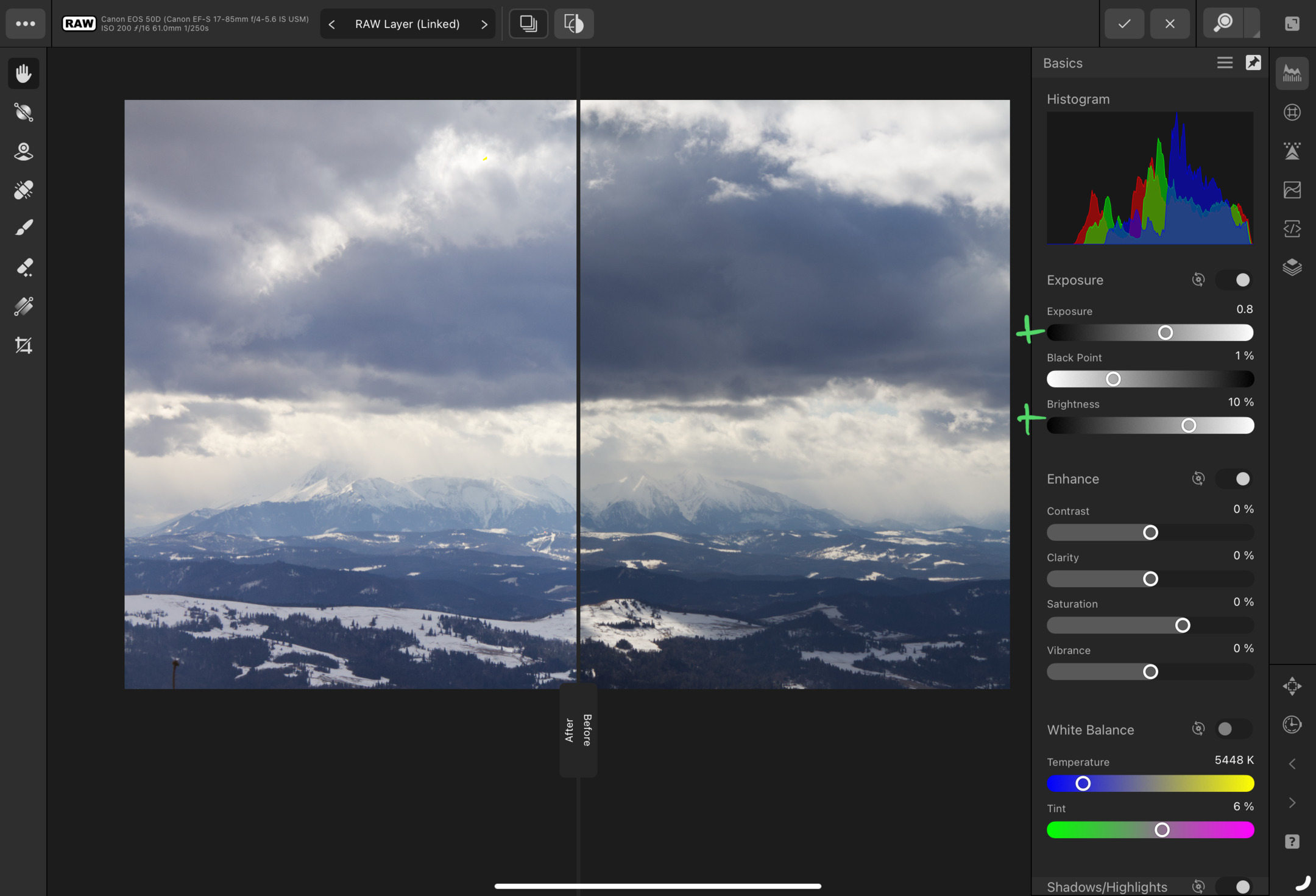
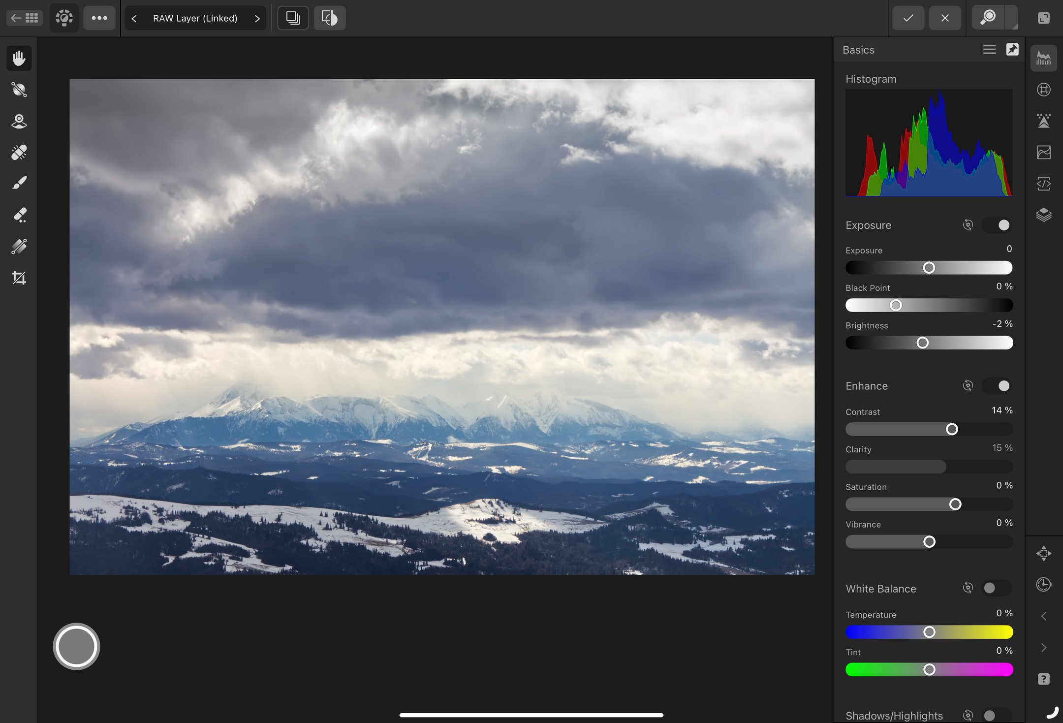
I started my adjustments with a slight Exposure and Brightness bump, and a small Black point increase to recover some contrast on the other side of the histogram. I decided that I was happy with these minimal adjustments because I didn’t want to overexpose any bright areas or make blacks too prominent.

Then, I proceeded with decreasing Shadows to make them stand out more and decreasing Highlights to recover some details from nearly blown-out areas. This maneuver made the image less punchy and contrasty, but it also made the clouds and mountains more detailed.
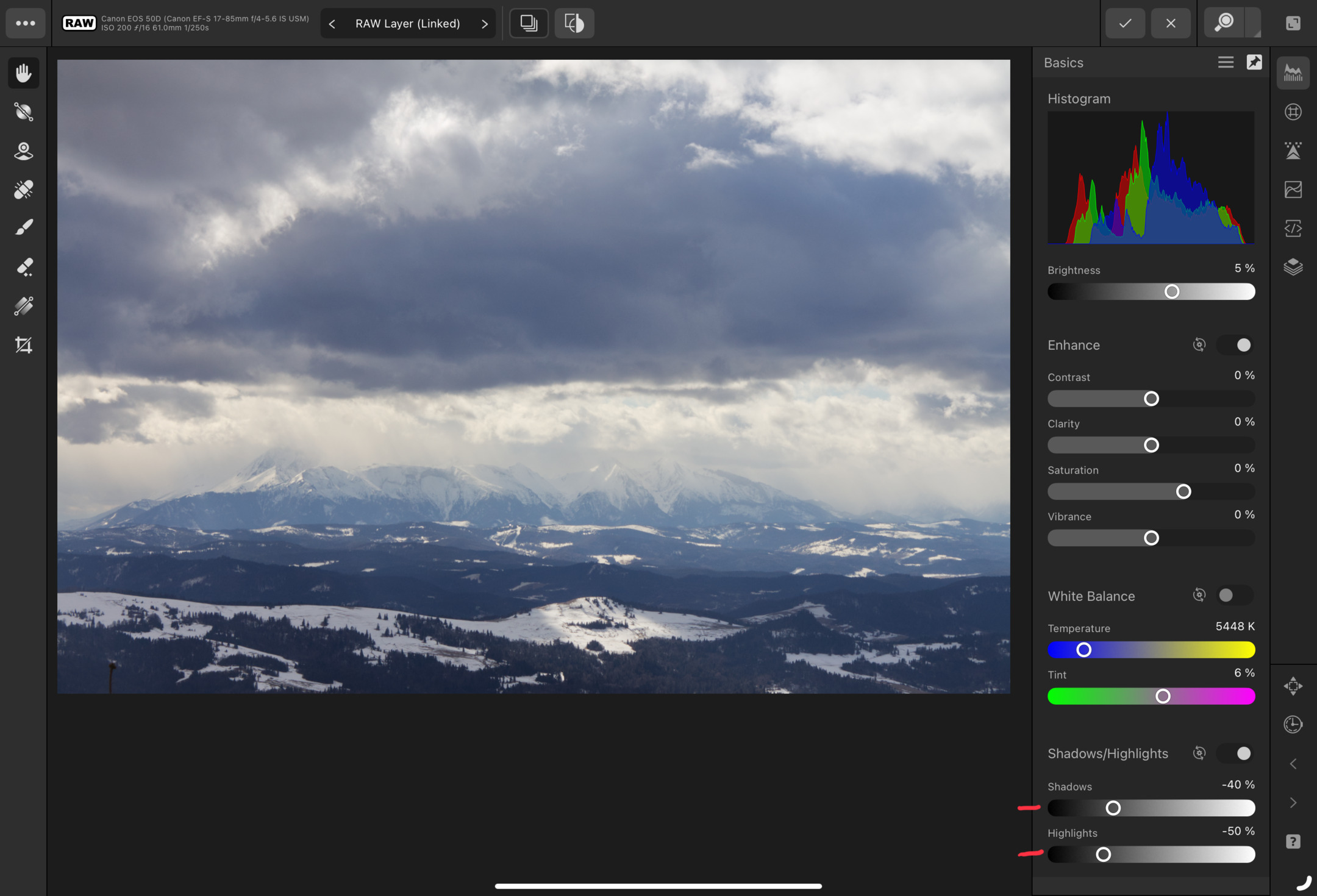
To compensate for the shadows and highlights decrease, I circled back to exposure adjustments and increased Exposure and Brightness. This way, I ended up with a fairly punchy and contrasty image, without any major losses in details.
Lens fixes #
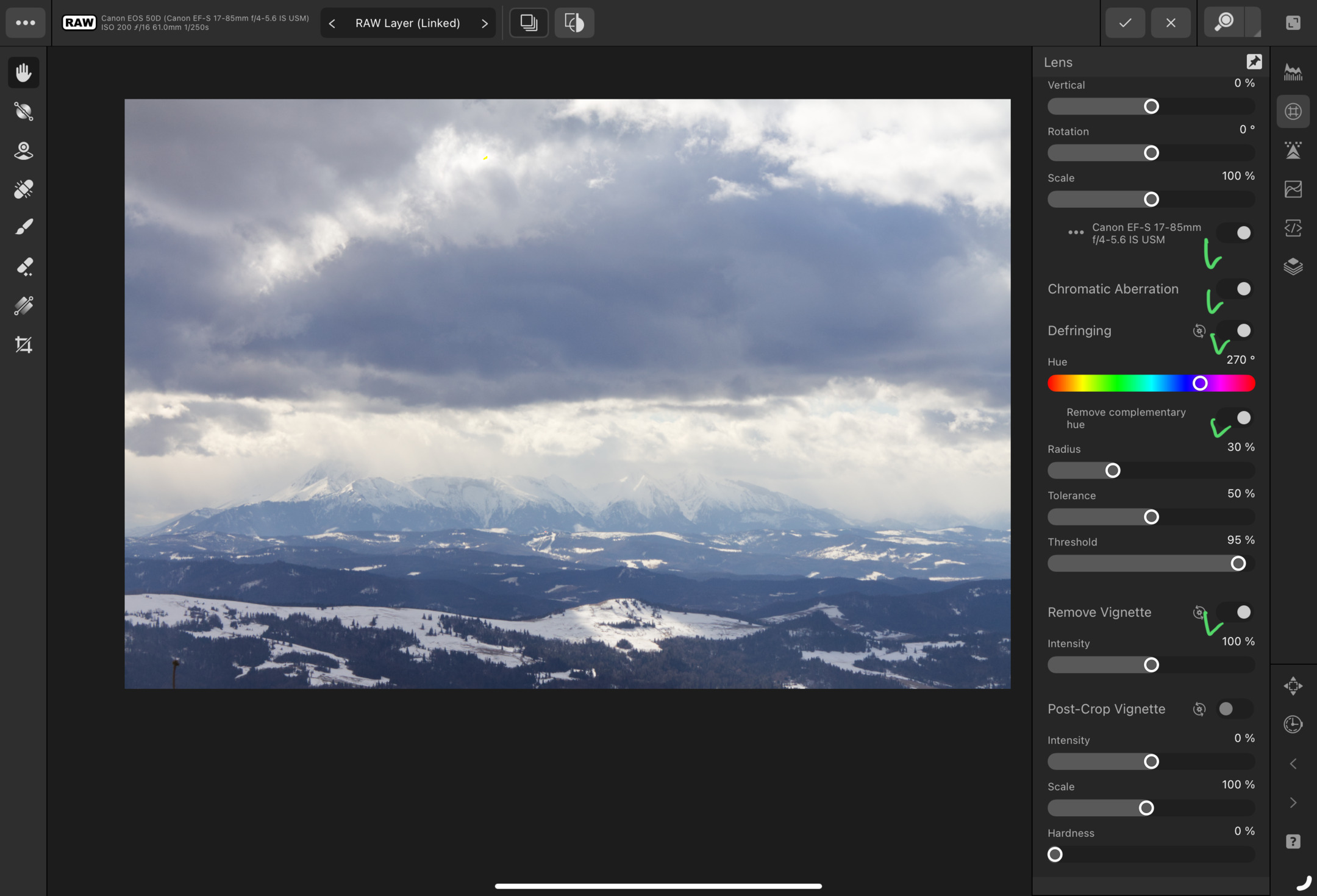
Now the boring part, I enabled all software fixes for artifacts created by my lens. This fixed pillow distortion, chromatic aberration, and vignetting.
Sometimes I don’t remove mechanical vignetting. However, I don’t feel like having a dark vignette in this photo.
Curves #
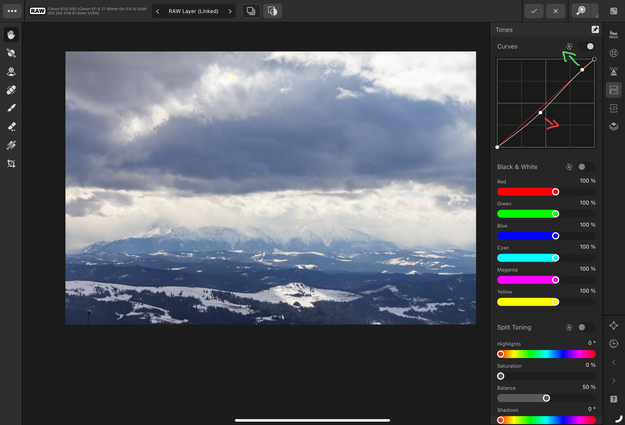
Adjusting Curves enabled me to increase contrast in a more controlled way than messing with the global Contrast slider. I went with a classic S curve that made very light tones lighter and middle tones darker, without impacting blacks too much.
Enhancements #
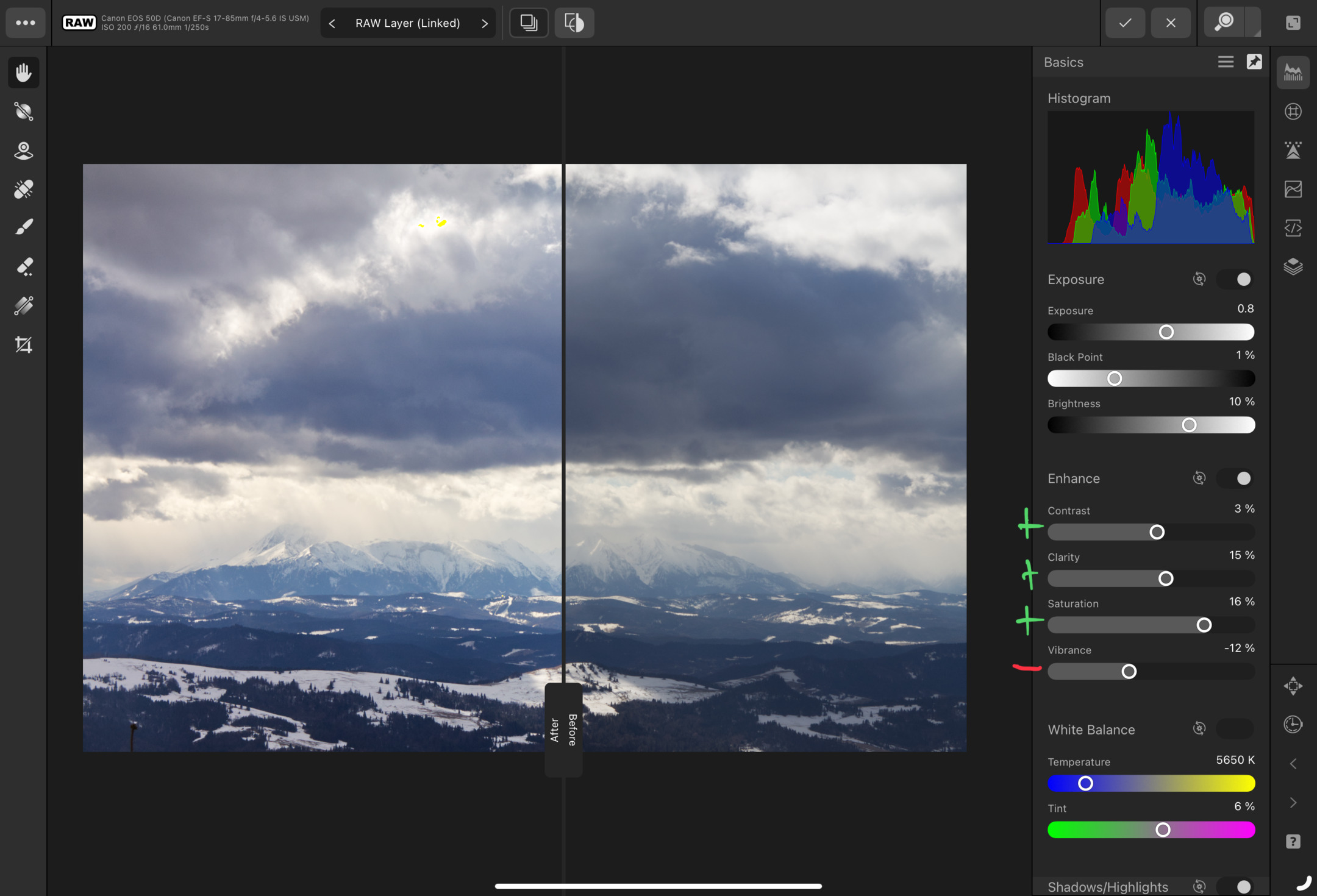
Now the fun part! Despite increasing the contrast by adjusting the curves, I also increased it globally with the Contrast slider. Furthermore, I increased Clarity to make contours more prominent. This enabled me to make clouds and mountains even more detailed.
Be careful with Clarity. Moving the slider too far may make your photo grainy and noisy!
For colors, I used my old party trick. By increasing Saturation and decreasing Vibrance, I made the dominant colors more prominent and muted complimentary colors. This reduced the variance of colors in the photo without making it desaturated.
Sharpening and noise reduction #
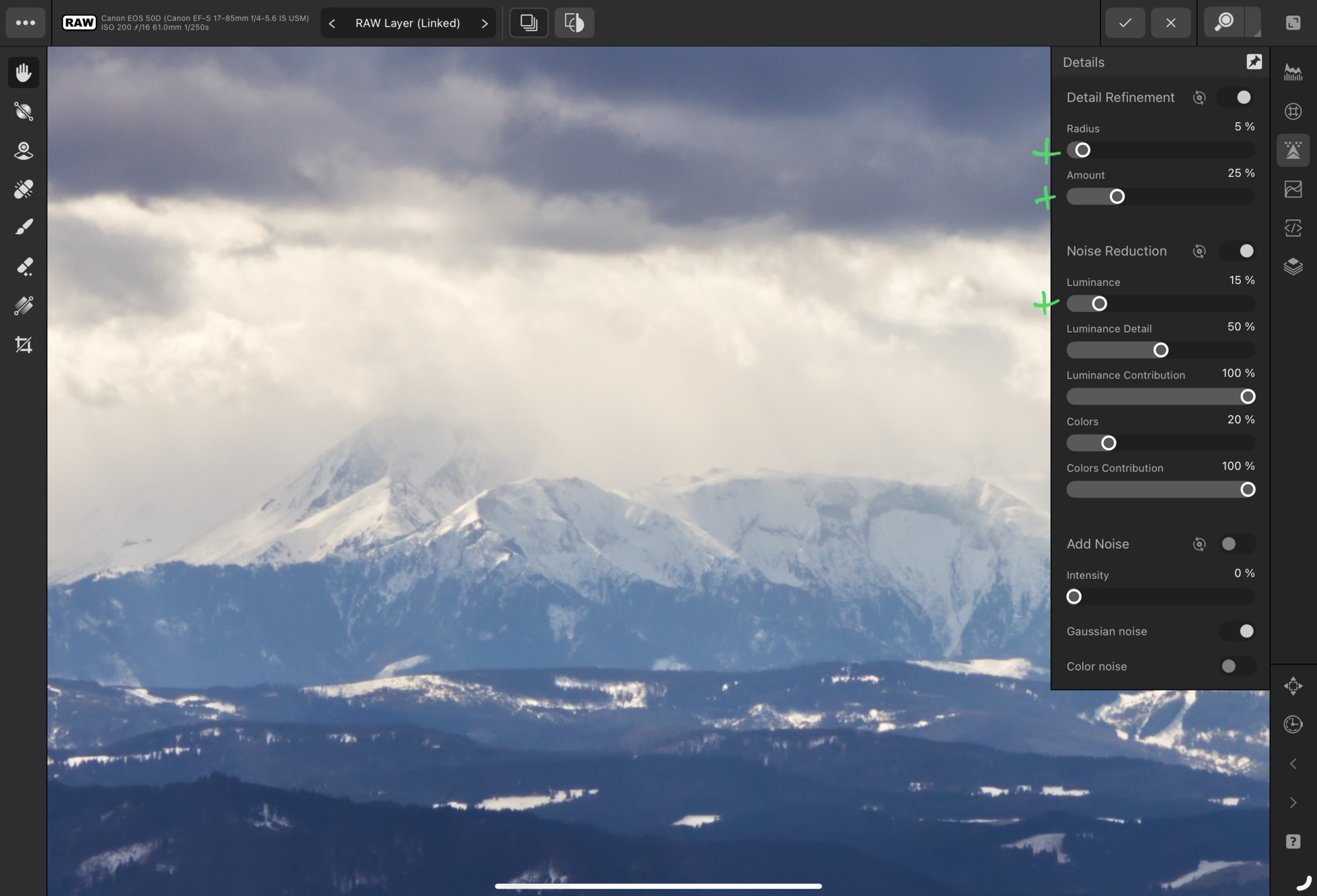
Before moving any sliders, I zoomed the photo in to see the noise situation better. Because of the low ISO, good light, and cold weather, there wasn’t too much noise. This meant that I didn’t necessarily have to worry about moving the Radius and Amount sliders too much.
Once sharpening adjustments were in place, I went ahead and applied some denoising by increasing Luminance. I didn’t want to make the photo look grainy and feel harsh.
Masking #
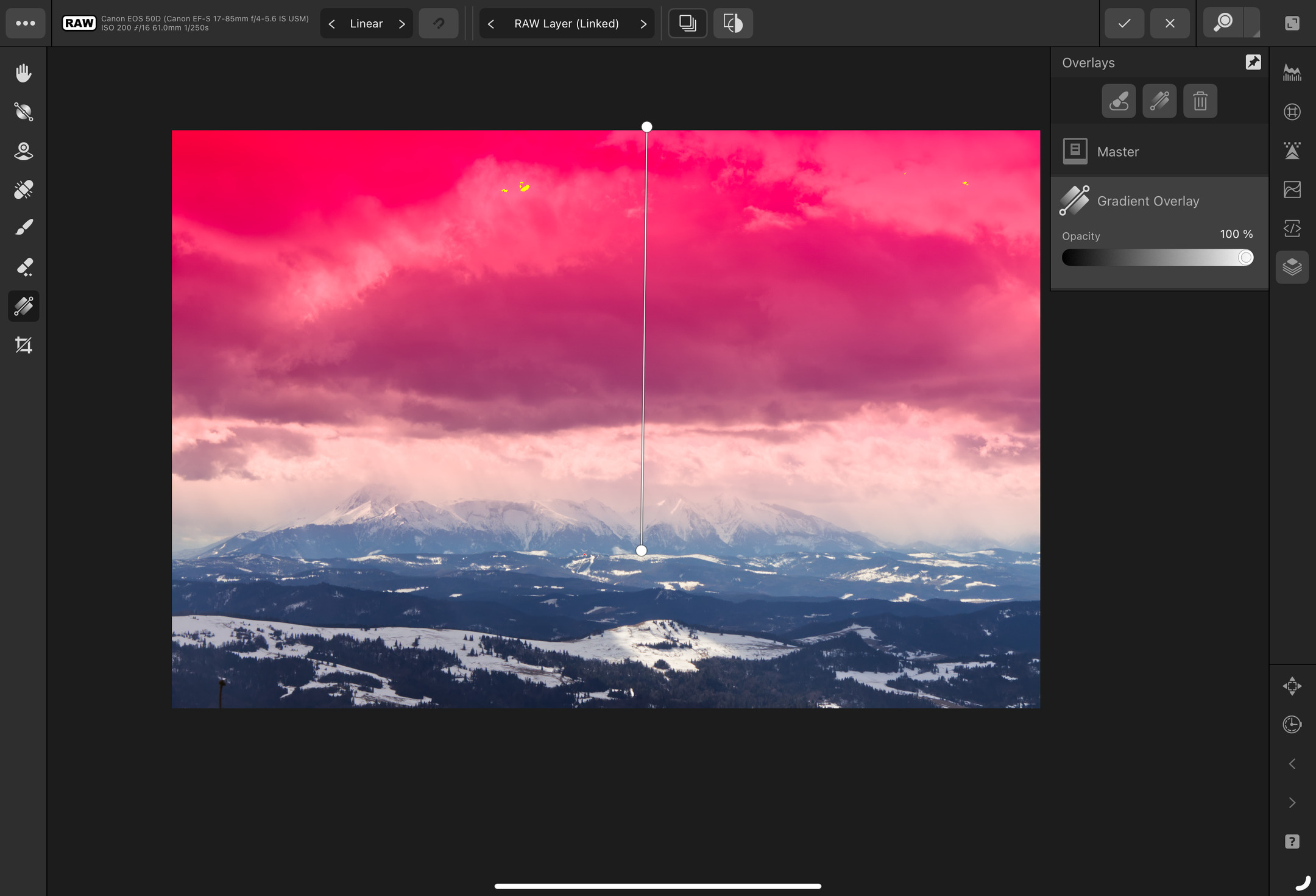
The heavy sky looked good as it was, but I wanted to make it even more dramatic. I decided to add a linear gradient to mask the sky and make some adjustments.
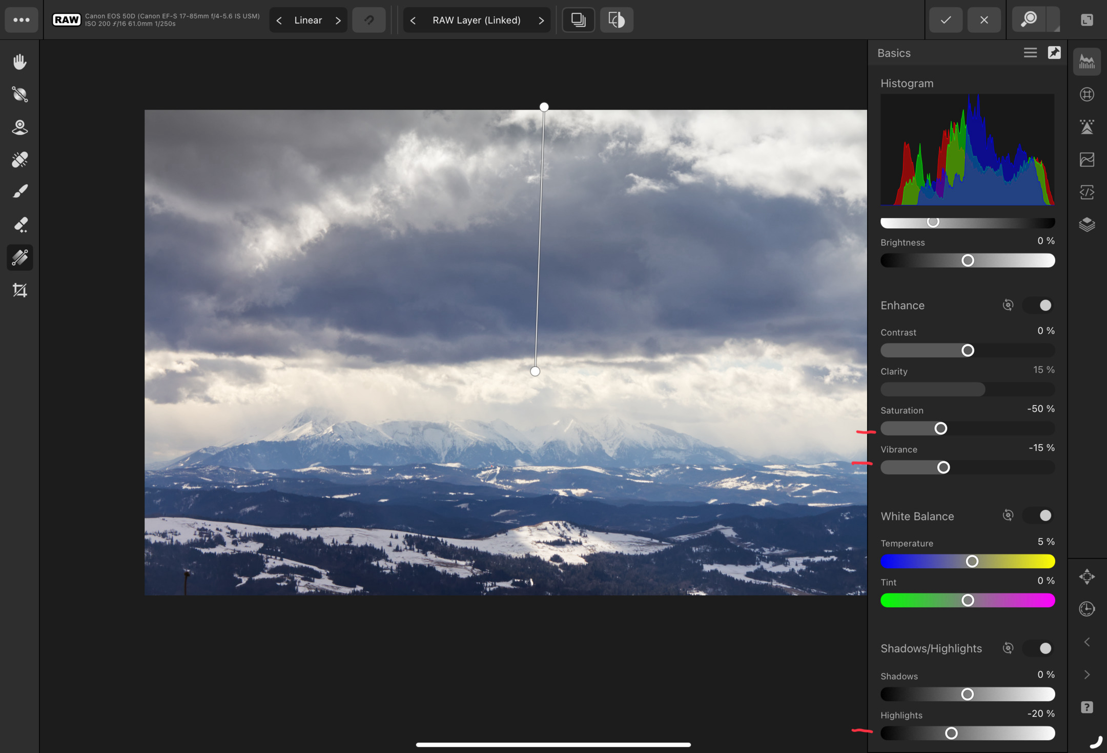
I decreased sky Saturation and Vibrance. Then, I adjusted its Temperature. Finally, I decreased Highlights a bit because the white balance change caused some overexposed areas to appear.
Then, I created another mask to apply local adjustments to the mountains.
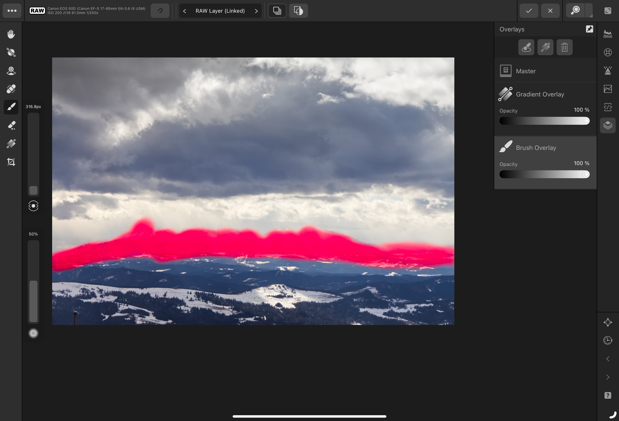
I decreased Brightness and increased Contrast of the mask. This made the mountains more prominent.
Spot removal #
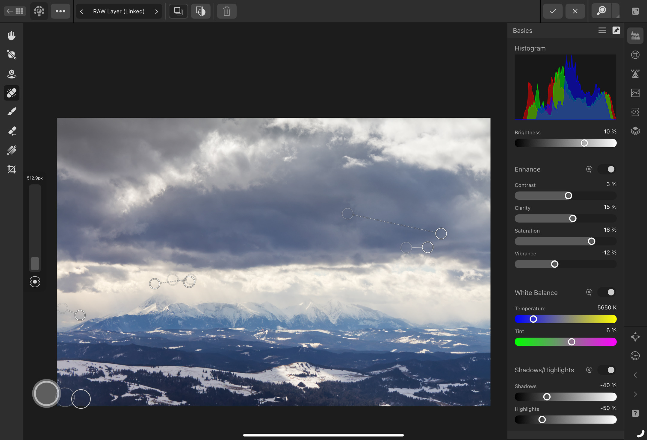
The lone treetop at the bottom left corner bothered me. I had to remove it with a spot-removal tool.
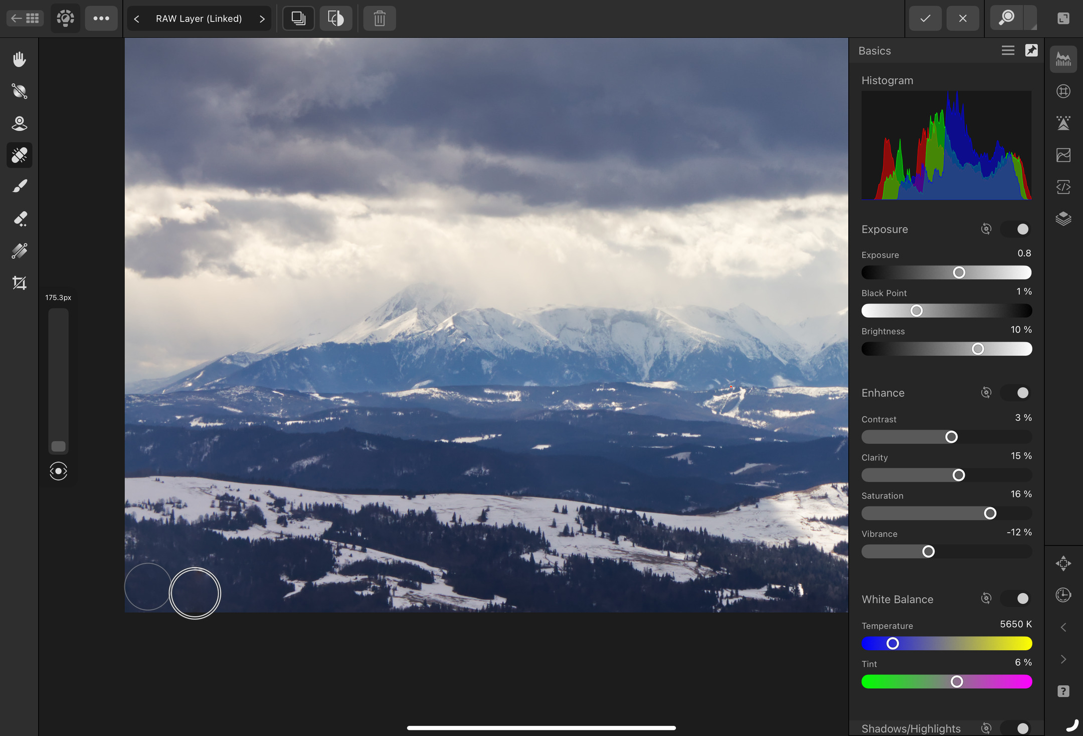
Then, I removed a couple of dust spots from my DSLR sensor. They gather when you swap lenses or change the zoom level. To remove them, you can either have them cleaned or apply fixes in software. I had no other choice but to do the latter.
If you have a dusty sensor, try not to use narrow apertures. The narrower the aperture is, the more prominent the dust specs in the image are.
Denoising sky #
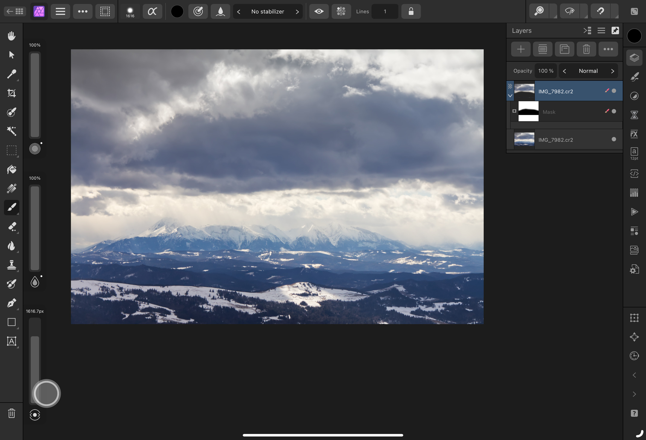
The photo looked good at this point, but I wanted to make the sky smoother. I don’t care about losing some details there, so I created a mask and then applied a Remove noise filter outside the RAW editor.
Result #
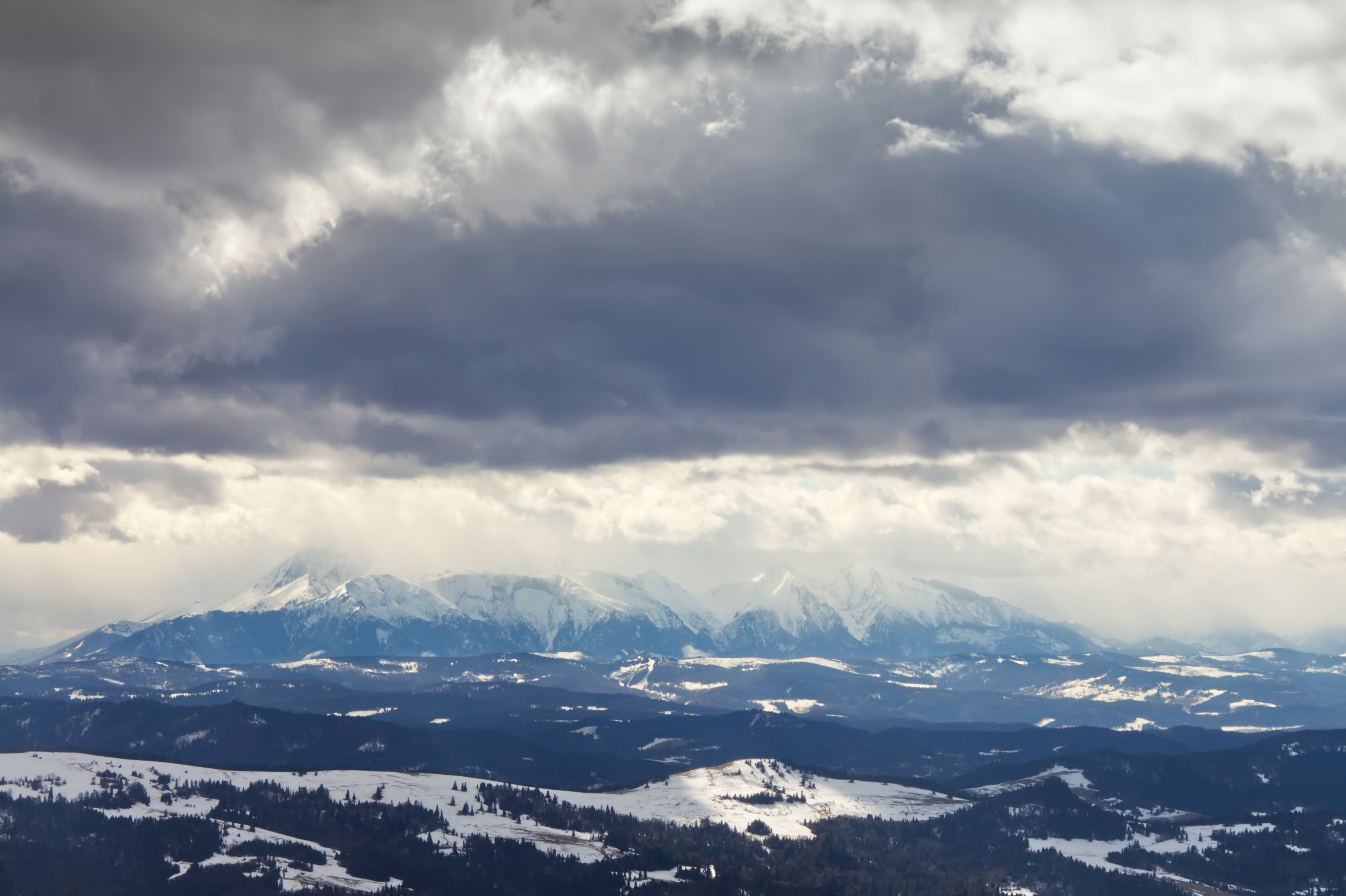
The developed photo looks exactly like I wanted it to look. The sky is still heavy, quite detailed, and smooth. The mountains are contrasty, with nice contours, and pretty prominent. The foreground is not too distracting.
Overall, the photo is more vibrant, detailed, and contrasty than the original one.
Further development ideas #
The thing I like about developing photos is that I can circle back to my edits whenever I feel like doing it. I may be tempted to try the following in the future:
- Crop the right side of the photo.
- There’s more negative space between the clouds and mountains on the right side than on the left side.
- Make the foreground less prominent
- The most interesting things in this photo are the mountains and the clouds. The foreground could be blurred a bit or made less contrasty.
- Experiment with split toning
- This photo could be stylized by distinctly colorizing dark and light areas.
- Add negative vignette
- Adding a white vignette could make the photo feel colder, and frosted.
- Experiment with white balance
- I’ve adjusted the white balance a bit, but I haven’t documented that. Oops! I could make the photo warmer to give it a sepia feel or go the other way and make it even colder.